Color

Blue Crush With Us

Blue is by far people’s favorite color. In fact, according to the popular real estate/design site Apartment Therapy , 42% of women and 30% of men prefer it over all other colors. We have seen this in our own experience as home stagers. Blue is the most common color we encounter in homes, on walls, bookshelves, carpets, cabinets, tiles, and sofas.

Here are some tried and true techniques that we employ when we work with lots of beautiful blue.

Living Room with dark blue walls and pops of color staged by Staged Ryte

Add More Color

When we are staging a room with lots of blue walls, we treat blue as a background color and bring in a lot of whites, neutrals and pops of color to diminish the strength of the blue. We transform blue from the primary color into one of a number of important colors. Painting your walls blue? Here are 50+ Perfect Blue Paint Colors.

Use Blues and Complementary colors

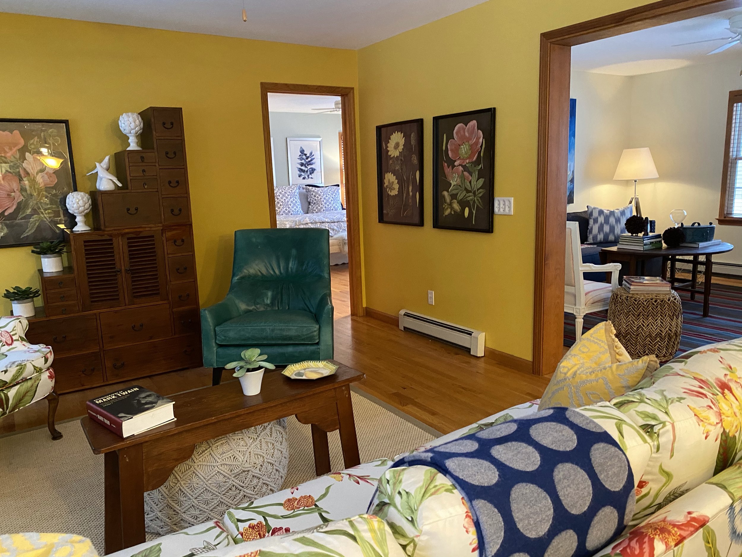
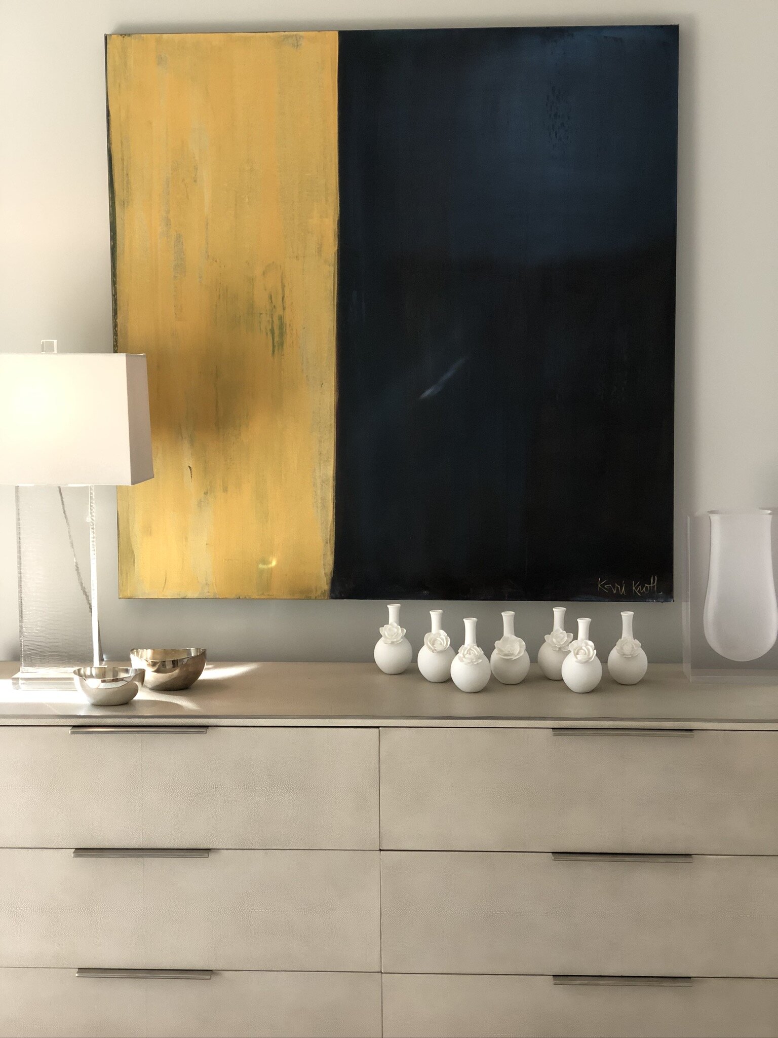
Sometimes we feature a bold blue pattern on furniture or accessories to make a statements with blue - we want to intrigue visitors’ eyes. Try a large floral patterned sofa in different shades of orange, which is a natural complement of blue. We employed this technique with a home that was languishing on the market with no offers. After the owner followed our advice, the home sold within two weeks for $50,000 over the asking price. In this photo, we used navy blue and orange to create energy. Below we used dynamic contemporary art in blues and blacks to draw the eye up.

Blue and White Crush With Us

A blue and white color scheme is timeless. If you have a lot of blue in a room, try balancing it with large swaths of white--on baseboards, ceilings, window sills, bannisters--to create a sophisticated and soothing atmosphere that will be pleasing to many people. Guaranteed. (If you love blue and white together, follow the Instagram hashtag #blueandwhitecrush ← we use it sometimes.) Here are more tips from Homes and Gardens on how to decorate with blue.

Textures Create Interest

If you have a large space of flat blue color, like a wall, use accessories with shiny finishes and textures that catch and reflect light. If your blue surface is shiny, try the opposite--nubby textiles and textures. This holds true for any large area of one color. 

Are you planning to sell your home? Or are you a realtor selling a home? We can stage it to maximize your sale price. Call us today at 917.543.4590 for a consultation or click here to contact us. If you don’t already, follow us on Instagram and/or Facebook @stagedryte

How Do You Decorate With Yellow and Gray? Pantone Colors 2021

Why does everyone seem to be using the exact same color at the same time? You go into a home goods or furniture store and you see the same pops of color at each one…it’s not a coincidence. We use some trending color in home staging, judiciously. Our goal here is to help you understand if YOU should use it in your home décor.

Since 2000 the Pantone Color Institute has promoted a Pantone color of the year (sometimes, as in 2021, a pair of complementary colors) that they believe evokes the spirit of that year. (Learn more about Pantone in our previous blog post: What Is a Pantone Color?) The 2021 Pantone Colors are yellow and grey -- Illuminating 13-0647 and Ultimate Gray 17-5104. In an unmistakable nod to our pandemic reality, the company describes the colors as “A message of happiness supported by fortitude…We need to feel that everything is going to get brighter – this is essential to the human spirit.”

So when you see this yellow and grey color scheme everywhere you look--clothing, makeup, graphic design products, even some kinds of specialty foods, like cakes and cookies--it’s not a massive case of color ESP among manufacturers and designers. It’s the result of a carefully orchestrated marketing effort that is meant to saturate the market with the year’s color.

Gray Sofa with Yellow Pillow Staged Ryte.jpg

Why are we telling you this? Well, if you’re painting and decorating a home, you have to choose a color scheme. When you look around for color inspiration, you’re likely to see this profusion of Pantone color of the year everywhere and you might be tempted to go whole hog with one of these beautiful, trendy colors. If you’re like us and staging a home for sale, sure: you can invest in some on trend colors. But if you’re decorating your own home that you’ll be living in for some time, you need to remember that “color of the year” means that soon it will be “color of the last year.” It will seem trendy and on brand this year but by next year the color is bound to feel dated.

Yellow May Not be Mellow

Also, it’s better to be more cautious with these very vivid Pantone colors because they are, in our experience, attention-getting shades that work better as accents than as the major color in a scheme--unless of course you are a highly skilled professional. Good examples in this Ideal Home UK article.

Subtle yellows and grays. Love it (not our design). Image credit: Simon Scarboro.

Subtle yellows and grays. Love it (not our design). Image credit: Simon Scarboro.

Pantone’s yellow – illuminating – is a bright hue that, like most yellows, requires major knowhow to pull off. It’s a major commitment. As a friend once asked when another friend was considering a deep Venetian red dining room, “Hon, do you really have that much to say?” The same goes for yellow. Do you really have that much to say? Most people don’t. In fact, by pairing it with gray, Pantone pretty much admits the necessity of using yellow with a more neutral tone. 

Doesn’t matter that the walls and carpet are beige. Gray is also a neutral and paired with the vibrant yellow contemporary painting by Kari Kroll, the room comes to life.

Yellow is also problematic in the sense that it’s a fussy color that reads differently in rooms facing west than in rooms facing east; in morning light versus dusk. Although the idea of happiness, optimism and energy it conveys is very attractive, yellow can also signal danger (think of the blinking yellow traffic light). 

If you feel you must have yellow, or any other intense, dark, or unusual color, as your dominant color,  make sure to test it on walls facing in all directions and during different times of day. Go to your local hardware store and purchase small sample sizes of paint to create your own large paint chips. You can also buy 12-inch square chips from samplize.com. You’ll be amazed at how different the same color looks in early morning sun and at noon and dusk. 

What do you think? Do you now know how to decorate with yellow and gray? Let us know if you need help!

Do you need help staging a home for sale or need a new look in your home? Call us at 917.543.4590. Email us at dawn@stagedryte.com. Or fill out our contact form.

What Is A Pantone Color?

Unless you’re a design professional you may not know about Pantone colors. But you surely have seen and/or used a Pantone color in your life. 

You may have noticed that when you walk into a furniture store that many of the staged rooms display throw pillows and other accessories in a particular shade of pink or a deep blue. Then in the housewares store you notice the same shade of pink or blue on the pricey new enamel cookware they are featuring. Then you’re in Sephora buying lipstick and you see that all the new packaging for your cosmetics brand is that same pink or blue. How could that be? Are you imagining they are the same?

yellow-contemporary-painting-gray-sham.jpg

No, you’re not imaging it. What you are seeing is the Pantone color effect. Those manufacturers are most likely using the current Pantone color of the year. 2021 colors are yellow - called Illuminating - and Ultimate Gray. Have you seen these colors online and in shops?

Pantone is a company that has been known since the 1960s for its development of the Pantone Matching System, a standardized system of color formulas that enables any manufacturer or designer anywhere in the world, whether producing clothing, housewares, or graphics, to precisely choose and reproduce a given color. The Pantone Matching System comprises 1,867 colors created by combining 13 base pigments. 

Pantone-Colors-2021.png

2021 Pantone Colors

Stay tuned for our next blog post. We’ll go into detail on how to use yellow and gray when decorating your home.

According to the Pantone website, “More than 10 million designers and producers around the world rely on Pantone products and services to help define, communicate and control color from inspiration to realization – across various materials and finishes for graphics, fashion and product design.”

Stay tuned for Part 2 – we’ll delve into this year’s colors of the year and how (or if) you should use them.

Want to read more about color? Read this blog post – Fear Not a Pop of Orange.