Interior Design

Actor Jayne Atkinson Loved It and Didn't List It

Home Staging Turns Into a Fresh Interior Design for House of Cards Actors

Actor Jayne Atkinson and husband actor Michel Gill had decided to sell their home. Their son was launched and they were ready to move on to new adventures. Jayne’s realtor, Leslie Chesloff of William Pitt Sotheby’s International Real Estate, recommended that Staged Ryte come in to advise on changes and updates, such as painting. We immediately hit it off with Jayne. (Honestly, who wouldn’t…she’s so warm and charming.) Staged Ryte transformed the interiors so well that Jayne and Michel decided to love their home and not put it on the market. A first for us!

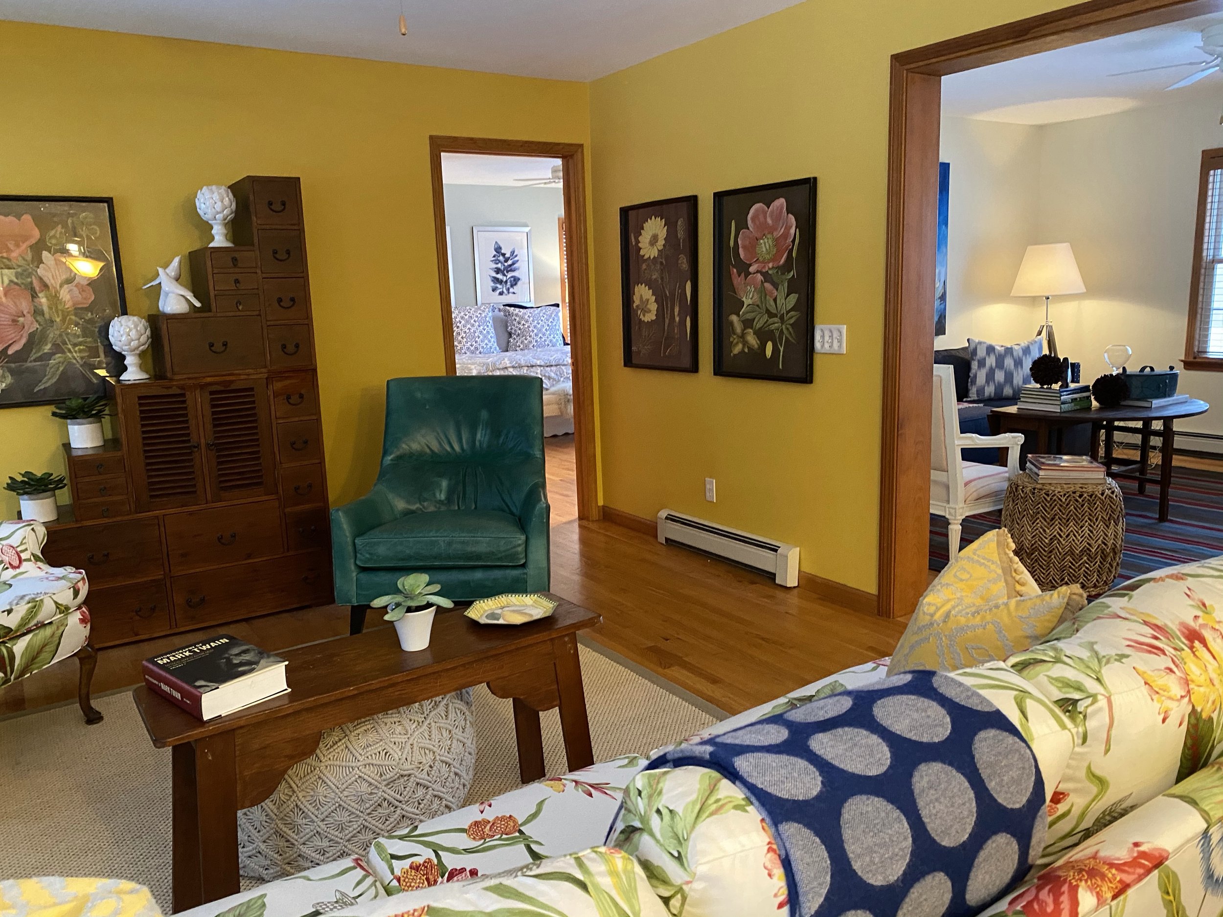
Dawn sat down with Jayne in her refreshed 1920s home in the Hill Section of Great Barrington and had a conversation about the home staging process and outcome. Watch the video! Jayne says, “I know you staged the house so that it would look good but somehow you captured my whimsy and brought in gorgeous color. It just helped me relax. Staging it gave it this crisp, clean new look.”

Jayne especially loves the orange-hued throw pillows. The living room colors tied in with an orange and blue rug in the primary bedroom that Jayne never knew quite what to do with.

Atkinson and Gill may be most recognizable from their roles as Secretary of State and President on the popular Netlix series, House of Cards. Both are seasoned performers on stage and in television and movies. Atkinson loves the Berkshires and supports theatre companies and cultural institutions. She most recently appeared in WAM Theatre’s “Miscast Cabaret” benefit at the Mahaiwe Performing Arts Center in July.

Actor Jayne Atkinson played Secretary of State Catherine Durant; Michel Gill played President Garrett Walker.

“Jayne was ready to sell! We walked through the house together - room by room - and identified furniture and accessories that should be edited or removed," says Dawn. "Then we made recommendations on paint colors and trim, brought in furniture, bedding and accessories to supplement and to help prospective buyers understand what their lifestyle could be like in the home." The dining room was completely transformed - piano, dining table, rug, chairs and accessories removed and replaced.

This was the first time a Staged Ryte client decided to keep their home based on its staging. They even purchased many of the staging furnishing, artwork, and other accessories. Trachtenberg says that it’s not unusual for home buyers to see a staged home and ask to certain buy pieces.

Watch the lively conversation between Dawn and Jayne on Staged Ryte’s…and please subscribe to our new YouTube Channel.

And the work continues. There are still some pieces to be sourced and brought into the home. Then Jayne and Michel will be ready to move back in!

Blue Crush With Us

Blue is by far people’s favorite color. In fact, according to the popular real estate/design site Apartment Therapy , 42% of women and 30% of men prefer it over all other colors. We have seen this in our own experience as home stagers. Blue is the most common color we encounter in homes, on walls, bookshelves, carpets, cabinets, tiles, and sofas.

Here are some tried and true techniques that we employ when we work with lots of beautiful blue.

Living Room with dark blue walls and pops of color staged by Staged Ryte

Add More Color

When we are staging a room with lots of blue walls, we treat blue as a background color and bring in a lot of whites, neutrals and pops of color to diminish the strength of the blue. We transform blue from the primary color into one of a number of important colors. Painting your walls blue? Here are 50+ Perfect Blue Paint Colors.

Use Blues and Complementary colors

Sometimes we feature a bold blue pattern on furniture or accessories to make a statements with blue - we want to intrigue visitors’ eyes. Try a large floral patterned sofa in different shades of orange, which is a natural complement of blue. We employed this technique with a home that was languishing on the market with no offers. After the owner followed our advice, the home sold within two weeks for $50,000 over the asking price. In this photo, we used navy blue and orange to create energy. Below we used dynamic contemporary art in blues and blacks to draw the eye up.

Blue and White Crush With Us

A blue and white color scheme is timeless. If you have a lot of blue in a room, try balancing it with large swaths of white--on baseboards, ceilings, window sills, bannisters--to create a sophisticated and soothing atmosphere that will be pleasing to many people. Guaranteed. (If you love blue and white together, follow the Instagram hashtag #blueandwhitecrush ← we use it sometimes.) Here are more tips from Homes and Gardens on how to decorate with blue.

Textures Create Interest

If you have a large space of flat blue color, like a wall, use accessories with shiny finishes and textures that catch and reflect light. If your blue surface is shiny, try the opposite--nubby textiles and textures. This holds true for any large area of one color. 

Are you planning to sell your home? Or are you a realtor selling a home? We can stage it to maximize your sale price. Call us today at 917.543.4590 for a consultation or click here to contact us. If you don’t already, follow us on Instagram and/or Facebook @stagedryte

What Is A Pantone Color?

Unless you’re a design professional you may not know about Pantone colors. But you surely have seen and/or used a Pantone color in your life. 

You may have noticed that when you walk into a furniture store that many of the staged rooms display throw pillows and other accessories in a particular shade of pink or a deep blue. Then in the housewares store you notice the same shade of pink or blue on the pricey new enamel cookware they are featuring. Then you’re in Sephora buying lipstick and you see that all the new packaging for your cosmetics brand is that same pink or blue. How could that be? Are you imagining they are the same?

yellow-contemporary-painting-gray-sham.jpg

No, you’re not imaging it. What you are seeing is the Pantone color effect. Those manufacturers are most likely using the current Pantone color of the year. 2021 colors are yellow - called Illuminating - and Ultimate Gray. Have you seen these colors online and in shops?

Pantone is a company that has been known since the 1960s for its development of the Pantone Matching System, a standardized system of color formulas that enables any manufacturer or designer anywhere in the world, whether producing clothing, housewares, or graphics, to precisely choose and reproduce a given color. The Pantone Matching System comprises 1,867 colors created by combining 13 base pigments. 

Pantone-Colors-2021.png

2021 Pantone Colors

Stay tuned for our next blog post. We’ll go into detail on how to use yellow and gray when decorating your home.

According to the Pantone website, “More than 10 million designers and producers around the world rely on Pantone products and services to help define, communicate and control color from inspiration to realization – across various materials and finishes for graphics, fashion and product design.”

Stay tuned for Part 2 – we’ll delve into this year’s colors of the year and how (or if) you should use them.

Want to read more about color? Read this blog post – Fear Not a Pop of Orange.

Fear Not a Pop of Orange: How We Use Vibrant Color to Add Personality to a Home

The color orange is not for the faint of heart. When a room is curtains to walls to rugs orange, to some it says, “LOOK AT ME! I’M HERE TO ENERGIZE YOU! THERE WILL BE NO RELAXATION IN THIS ROOM.” Right? However, orange used judiciously can lend warmth, charm and personality to a living room, kitchen, bedroom or study. It’s joyous. It’s enthusiastic. It’s vibrant. And it’s a bit flamboyant without being aggressive.

Here are four examples of how we’ve used orange to lend personality to staged homes.

These saddle-orange chairs are an anchor in a large and open living area. The orange against the stone fireplace helps warm up the room. Imagine blue chairs – the room would feel much cooler with the blue pillows and a blue desk. FYI: Orange and blu…

These saddle-orange chairs are an anchor in a large and open living area. The orange against the stone fireplace helps warm up the room. Imagine blue chairs – the room would feel much cooler with the blue pillows and a blue desk. FYI: Orange and blue go well together because they are complementary colors – directly across from each other on the color wheel. This home in Canaan, NY is listed by Jennifer Capala, William Pitt Sothebys International Realty

Art: A simple orange painting – no frame (by our friend Kari Kroll) – lends happy energy to white walls in this country-chic renovated farmhouse. The raspberry-patterned chairs are an analogous color (on the same side of the color wheel), so the ove…

Art: A simple orange painting – no frame (by our friend Kari Kroll) – lends happy energy to white walls in this country-chic renovated farmhouse. The raspberry-patterned chairs are an analogous color (on the same side of the color wheel), so the overall feeling is comfortable. Bottom line? These colors play well together. (Want to learn a bit more about color theory? Click here.)

Dark wood and tan tile are energized by orange accessories in this city apartment. The orange also works with the blue sink. See how we tied it all together with that make-up brushes cup above the sink? It’s the little things! Photo: Ellen Silverman.

Dark wood and tan tile are energized by orange accessories in this city apartment. The orange also works with the blue sink. See how we tied it all together with that make-up brushes cup above the sink? It’s the little things! Photo: Ellen Silverman.

Mixed-pattern orange pillows lend energy to this Lenox, MA condo’s neutral pallet. We love to combine patterns when we can. It brings a sense of joy to a staged room.

Mixed-pattern orange pillows lend energy to this Lenox, MA condo’s neutral pallet. We love to combine patterns when we can. It brings a sense of joy to a staged room.

We love orange – but it’s only one color – we use all the other ones too! Click here to see more of our recently staged county homes - and click here to see some recent city homes.